18 Dental Website Must-Haves That Boost Patient Bookings
Your dental website isn’t just a digital business card—it’s the front door to your practice. Patients form opinions in seconds, and that first impression can be the difference between a booked appointment and a bounce.
Here are 18 essential features every dental website needs to increase trust, connect emotionally, and drive more bookings than your competitors.
18 Essential Features Every Dental Website Needs
1. Clean, Modern, and Professional Design
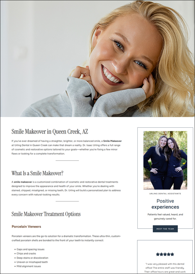
A sleek, airy design with plenty of white space and soft neutrals sets a calm and high-end tone. Modern typography ensures readability and polish.
Unlike outdated, cluttered sites, a modern look instantly conveys trust, professionalism, and care.

2. Exceptional Use of Branding
Strong visual branding—custom photography, warm tones, and unique fonts—creates a distinct identity.
When a dental website feels cohesive and personalized, it shows attention to detail and makes your practice more memorable.
3. High-Quality Custom Photography
Real photos of the doctor, team, and the office create immediate trust and relatability. Patients want to see who they’ll be meeting.
This level of photography conveys competence, cleanliness, and a welcoming atmosphere.
4. Emotionally Resonant Messaging
Language that connects on a human level wins. Messaging like “Reimagine the dental experience” helps calm fears and creates emotional rapport.
It’s not about the procedure—it’s about how the patient will feel before, during, and after.
5. Clear, Strategic Copywriting
Each section should speak directly to patient benefits, not just features.
Strategic headings and copy are scannable, reassuring, and easy to digest—a rare find in healthcare websites.
6. Streamlined Navigation
A clear and minimal top menu without overwhelming users is a must. It should be a navigation bar that includes only what patients need most: Home, About, Services, Contact, etc.
The simpler it is to find info, the quicker a visitor becomes a patient.
7. Excellent Mobile Responsiveness
With over 60% of users on mobile, your website must look and function flawlessly on smaller screens.
Responsive layouts ensure readability, usability, and a seamless experience from any device.
8. Unique & Trust-Building Homepage Layout
A high-converting homepage flows logically from an emotional hook to services, then social proof and call-to-action.
And, a “Meet The Dr.” section with a personal message builds instant trust and likeability.
9. Strong Call-to-Action Placement
A standout “Request Appointment” button should appear at the top of the site and scattered throughout, making it easy for users to take the next step without digging!
Clear CTAs mean patients are never more than a click away from taking action.
10. Subtle Animation and Micro-Interactions
Gentle fades, hovers, and scroll-triggered animations makes a site feel modern and polished rather than static or outdated.
It also enhances engagement without distraction.
11. Modern Typography
Typography tells a story. Elegant serif headlines paired with clean sans-serif body fonts create a boutique feel and improve readability.
Good typography subtly signals high quality.
12. Local SEO Optimization (Structure)
Optimizing structure means proper use of headings, location mentions, internal linking, and service-area mentions.
Clear location-based language (without keyword stuffing) ensures your site shows up in local searches—and helps Google understand what you offer and where.
13. Emotional & Psychological Design Elements
The use of warm lighting, natural textures, and comforting visuals evokes a sense of peace—important for anxious dental patients.
A website that evokes spa-like or wellness-brand vibes instead of a clinical, cold dental facility can drastically reduce dental anxiety.
14. Minimal Yet Effective Social Proof
Keep testimonials simple, authentic, and credible. Avoid overloading pages with reviews—just a few genuine ones go a long way.
This keeps trust-building subtle and clean.
15. Simple, Elegant Footer
Your Contact info, hours, and branding should all be present but not cluttered.
It should match the brand’s sophistication: modern, thoughtful, and polished.
16. Accessibility-Friendly Choices
Clean font sizing, good contrast, and uncluttered layout choices make your site usable for more people (even if not fully ADA compliant).
17. Thoughtful Service Pages
Each service page should be visually consistent and content-focused, not template-heavy.
They should be designed to educate and comfort, not overwhelm. FAQs and copy that educates rather than sells are best.
18. It Feels Boutique, Not Corporate
The overall vibe of your site should feel like a personalized, boutique dental studio rather than a sterile, insurance-focused clinic.
That alone will set you apart from 80%+ of local competitors.
Why It Matters — And Why Your Marketing BFF Is Different
Most dental websites look the same: sterile, cluttered, and impersonal. Patients are craving a different experience—one that’s modern, welcoming, and easy to trust.
This is what sets a Your Marketing BFF dental website design apart.
We don’t use cookie-cutter templates. We design boutique, emotionally engaging, SEO-optimized dental websites that connect with patients and book more appointments.
If you’re ready to finally have a dental website that reflects the quality of your care and sets you apart in your market—we’re your team.
👉 Let’s create something extraordinary and grow your bookings. Reach out today.
